Tuesday, December 13, 2011

Post Sixteen: The Last One!

It's hard for me to believe that it's the end of the semester, so, to help me cope, I'll blog about the following:

Observe how hideous this drawings is. 


Monday, December 5, 2011

Post Fifteen: Cumulative Relevance!

Recall my two previous posts; I was ecstatic about learning how to pin muslin onto a form and how to sew in an invisible zipper.

Need I explain my feelings about this?


Ta-da!  This is the mildly finished muslin of my very own draped-with-love, high-waisted, wrinkled pencil skirt.  It's a little tight on the form, but I don't even care.  


Check out that zippah.  Granted, it's not as good as my last one, but I will most certainly take it.  I'm glad I made a muslin before going on to do the final.  There was a time when I thought the muslin step was one for sloths and fools, but now I see the light.  Case in point: I now know that my zipper needs to be two or three inches longer (the skirt could barely fit over the form's collapsable shoulders!).  Also, I love sewing in zippers.  


Oh, what a lovely yet functional zipper!  

The excitement associated with knowing how to sew a zipper is trumped only by the excitement of knowing how to sew a zipper into a garment.  Seriously, I feel like a champ!  

I know what you're thinking.  How could this thing get any cooler and/or more exciting?


Like this!  Here's the skirt as if it were part of a dress!  I don't particularly enjoy the design of the dress.  The assignment was just to put one together.  I do, however, adore the idea of seeing the same muslin skirt in two contexts; I think it really changes the identity of the skirt.  The waistband is replaced here by a bodice with tucks (which were also a very exciting idea with which I could experiment).  


Here's the herringbone I'm going to use in my final skirt!  I can't wait to actually do it.  I would have done it already, but we have to do it together as a class...mild bummer.  It's probably better that way though; for all I know I'm doing it completely wrong.  I don't even care <3

Monday, November 28, 2011

Post Fourteen: Zips Don't Lie

Remember the skirt I draped that I was talking about the last time I blogged (if not, it's no big deal; just scroll down a ways and you'll be promptly reminded)?  Well, it turns out that there needs to be some sort of functioning closure (something I only ever half considered in my designs).  Ipso facto, my 3D classmates and I were treated to a demo on how to sew an invisible zipper.  There were many steps and I took copious notes.  Usually, when there's a demo in class, I understand what's happening, but have the utmost difficulty in applying the procedure within the comforts of my own home.  Perhaps it's my nerves, but whatever the cause, I took extra care with my notes this week.  

Observe: 


Needless to say, I am not as experienced a sewer as my 3D teacher; imagine the level of intimidation I felt upon seeing her invisible zipper (which, if you ask me, looked more like a normal seam from the front) and wondering how on earth I could make one even remotely similar.  I was in awe of how well she made it.  Granted, there were issues with the tension on the machine she was using, but her process seemed effortless and the product was fabuloso.  

Observe: 


Realizing that I couldn't let my fear paralyze me, I got down to business.  I cut and ironed my muslin and zipper, marked out all my sew lines, and followed every instruction as I had written it.  It wound up not being as hard as I thought it was going to be.  Overall, I'd say it was a very straightforward process. Even so, I felt ridiculously satisfied when I reached the end product.  

Observe it: 


I realize that this is far from perfect.  I also realize that my being able to sew a sample invisible zipper does not make me a master seamstress.  However, it makes me feel like a rock star.  I have a new-found love for invisible zippers, and can't fight the urge to put them into all of my designs.  I have yet to learn how to sew in centered and lapped zippers, but something tells me I'll be obsessed with those as well.  I've always liked zippers (Schiaparelli style), but now that I more thoroughly understand them, I can appreciate them, or at the very least accurately value them.  


Look!  My zipper actually opens!  If that isn't the coolest thing ever, then I don't know what is.  

Sunday, November 20, 2011

Post Thirteen: Through the Drapevine!

My first twelve or thirteen weeks here in the Fashion curriculum have been ridiculously informative; I feel like I'm learning/hearing about new things every day.  Things that I barely know existed three months ago are now my current obsessions -- and what's more, they actually make sense!  The most recent addition to my list -- "Things That I Didn't Understand When I First Heard About Them A Few Weeks Ago" -- is draping/pattern drafting.  
This "draping" is something I have heard of for a while, and once thought pertained only to non-tailored garments.  Then I reached Week 6 of my Integrated Studio 1 class, and things changed.  I was "draping" shirts to make new shirts and it was exciting.  Meanwhile, my teacher had been mentioning "draping" collars -- zero sense.  She had spoken of "draping" patterns, and how she preferred that method to using slopers and pattern manipulations (the only thing I knew!) -- less sense.  I could not wrap my mind around how someone could put fabric on a dress form, pin it, and then mysteriously have a sloperless pattern.  What seemed to me was that using a 3D dress form to make a 2D pattern that would go onto a 3D person was confusing; I much preferred (conceptually) the idea of taking slopers and making alterations to them.  
Then one day, during one of the most eye-opening demonstrations I have received ever in my 13 weeks in the fashion curriculum, I was shown how to "drape" a skirt.  All of a sudden, everything made sense -- darts, curves, this "twill tape" I was instructed to buy, grain line.  I felt enlightened.  After the demonstration, my teacher sent us off to "drape" our own skirts and make patterns from them!!!!!  I thought (and still think) that that was the coolest thing ever.  I went crazy.  I was a "draping"machine.  True, I barely know the difference between a tuck and a pleat, but that's no big (I hope).  Participating in this activity -- which  presume is relatively simple -- gave me a sense of legitimacy and cemented my intent to become genuinely interested in and fully consumed by the things I explore with/design.  Below are some of my findings!  


Here's a skirt front with some pleats.  I think these are inverted box pleats?  I know I should be embarrassed that I'm not 100% positive, but I'm too distracted by how excited I am that I can make a pattern from this.  


Oh, here's an example of my going fold-wild.  I don't think I would be able to make a pattern out of this "drapery" -- maybe next semester.  But I do give myself an A for effort!  


Here's a pattern I actually drafted myself!  This part was so nerve wracking and also exhilarating.  I was so scared that my line would look hideously wonky or wouldn't resemble a skirt pattern in the least.  I think it came out pretty okay for my first time!  I just hope that when I actually make the skirt it works.  


Here's what I "draped" to make the pattern!  In my head, it's ridiculously edgy and 1000% cool.  I am well aware that it isn't obscenely interesting, but I don't really care.  I designed it from scratch; that's all I really need to feel great about it.  

Sunday, November 13, 2011

Post Twelve: The Timelessness of the Fashionista

When you think of grandmas (specifically, ones who go by 'Grammy,' or 'Grams,' for short), what images come to mind?  For my Grammy, the images include rice balls, playing cards, and polo shirts.  
For every styling-related urge I had throughout my childhood, Grammy as my canvas; whenever I wanted to play with someone's hair, it was hers.  Whenever I wanted to put make-up on someone's face, it was hers.  
To my pure delight, Grams and I went to Saks Off Fifth.  If you knew Grams, you could imagine the amount of complaints she had while I styled her with the various designer accessories we found.  But, unfortunately for you, you don't know Grams.  So you don't know how she went on and on about how "stupid" I was making her look.  I'll have you know that by the end of our style sesh, she was picking out accessories herself -- and even combining them.  As much as she may have pretended to hate the whole experience, she and I both know that that was not the case; she was in hysterics the entire time.  She's been a little stressed lately (without going into too much detail, she just sold her house and is in the process of moving), so making her laugh is currently one of my favorite things to do.  You might think that it's a cheap connection to fashion, but I loved finding a way to merge making Grams laugh and designer fashion accessories.  She is one of the most interesting personalities I've ever met, and I love making her happy.  One of the things I want most out of my career in fashion design is to make people that happy.  You don't know true happiness until you've made a seventy-one-year-old laugh hysterically in the middle of a Saks Off Fifth.  
Perhaps what I found most inspiring about the entire experience was the fact that Grams, whose wardrobe consists of polo shirts that don't come from Ralph Lauren, was modeling.  Every time I told her to strike a pose, she did, as if she were on the runway.  I found that very interesting -- how jovially casual she was, and how that compares to runway dramatics.  It reminded me of the Lanvin 2011 ad campaign.  To me, both that and Grams's photo shoot are fashionably fun, and all I need to smile.  


$350 sunglasses?  No match for this fashionista.  Did you know she can blow bubbles with any kind of gum?  Observe the polo shirts.  You can't tell, but she's loving this.  Obviously, so am I.  Any time I can combine my two favorite things, fashion and family, I am set.  


Grams is well aware of the oncoming trends.  Here, she models a colored fur hat.  It's rabbit, in case you were wondering.  


Here's the 2011-2012 Lanvin ad.  It was shown to me a couple of weeks ago in my Integrated Studio class, and I can't get over it.  While I respect, recognize, and observe the earnestness of fashion, I feel that there is absolutely a place for clever movements such as this.  


Oh, and one more thing!  Grammy granted me permission to use blog these photos only under the condition that I show a photo of how she really looks.  So, everyone, here she is.  

Sunday, November 6, 2011

Post Eleven: Ruh Roh

I'm not going to lie -- I was a total cartoon junkie when I was younger.  I spent my productive childhood being entertained by the likes of many a cartoon -- from the classics (Bugs was my top Loony Toon), to the gritty nineties' Ren & Stimpy, to the fairly modern Spongebob Squarepants.  I loved them all.  Even today, I find myself tuning into the occasional wabbit season, or accidentally laughing out loud at The Fairly Odd Parents or Futurama -- two of the more clever shows I've come across.  I don't quite know what keeps me coming back to them; I'm well aware of how embarrassing it is to be happily watching them, but I can't stay away!  I'm fairly positive that my kindergarden self wasn't attracted by the witty banter, but rather by the jovial use of movement and color.  I know this is going to sound absolutely absurd, but cartoon characters have an animation (really, no pun intended) that I find fascinating.  Their liveliness and indestructibility are things that we, as humans, can't legitimately possess.  I've never really thought about it before, but those qualities are very well epitomized by the characters' appearance.  Most cartoons are made up of simplified, stylized lines and flat, often bright (depending on the time period, demographic, and artist) colors.  These qualities push the characters just far enough away from reality so that viewers may suspend their corporeal disbelief.  I realize that I am more than likely reading far too deeply into something so childish, but the topic really got me thinking.  Moreover, I started to think about the idea of cartoon color/line/movement schemes and fabric prints; if clothes could embody the ideals portrayed by cartoons, then the clotheswearer would follow suit.  If handled accurately, a person could be dressed to look 'lively and indestructible' -- unwaveringly fun.
That being said, you can imagine my delight when I feasted my eyes on the scene showed below.  Yes, somewhere, deep within the residential streets of Staten Island, there lies an extremely devoted member of the gang (for those of you who aren't that familiar with the many adventures of Scooby Doo, the characters are well versed in seventies jargon...and fashions).


I'm completely obsessed.  I'm thoroughly jealous.  I'm aware that this is almost as embarrassing as carrying around Pokeballs (...of Pokemon.  Don't worry; I was never really a fan.), but I was literally stopped in my tracks by how cool this was.  


It isn't a bad likeness either; I've seen some seriously homemade versions on TV or the internet.  But this is borderline professional.  I'm thinking of hiring the owner of the vehicle for some detective work.  


Here's the gang.  I think they very much visually demonstrate what I was writing about.  For some reason, instead of making them seem stationary, their two-dimensionality and flat, bright colors work to bring them to life.  


I used some colors I "eyedroppered" from the first photo to make a motif; the colors are somewhat dated, so I sought out to make a motif that followed suit.  


While I certainly can't see such a print on Daphne (why, yes, I did just reference that fashionista cartoon character as if she were a real person), I dig it.  I tried to reference the movement of the characters as well as their colorful flexibility.  

Sunday, October 30, 2011

Post Ten: Text(ile) Message

If you remember my garden post a few weeks back, then you'll remember that my dad is an upholsterer.  As such, I've been around these gorgeous, expensive fabrics my entire life.  While I've always enjoyed them, I have never really been able to appreciate them until this year, during my interaction with them and various readings required.  Maybe it's because I was, before my enlistment as a fashion student, previously uneducated in the field, and my exposure to it now has sparked my interest.
Whatever the cause, I love fabric -- patterns, weave, weight, classification, pretty much anything I can attempt to identify.  Fabric choice is usually the first thing I notice in a garment, whether I'm designing, constructing, or simply viewing it.  In Integrated Studio 1, our next project is Body As Narrative, and we're invited to use prints, so I've been looking into how prints are informed by the design and how they help to communicate the idea behind it.
So0o0o, I took a trip on down to my dad's upholstery shop, and perused his showroom.  In terms of fabric, it's pretty decked out.  There are so many different kinds that are just exciting; most have wound up in the back of my head as I'[m thinking about future and/or current designs.  
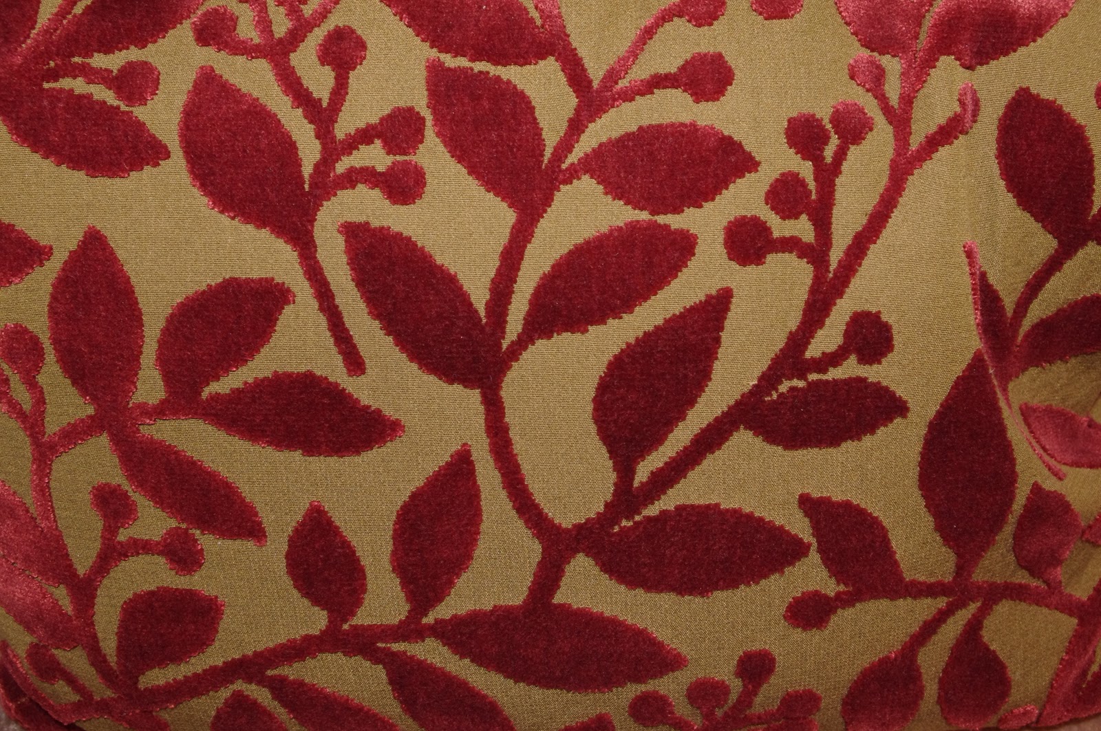
Being that there so many textiles there that it would be too overwhelming to try to absorb them all at one time, I decided to focus on a choice few.  I looked at patterned ones that made reference to nature; I chose this because I feel like, in fashion, patterns and prints are a prominent outlet for expressing nature as inspiration.  Texture is equally expressive, and the fabrics I came across in the showroom have texture up the wa-zoo.


I think this is ridiculously luxurious.  I like the way the crushed velvet's color makes the leaves look fossilized.  But rich, at the same time!  


The stylized branches are a bit of three-dimensional pizzazz.  The fabric was used on a small, simple pillow.  Because the fabric is such a loud one (meaning that it is visually potent; its texture, palette, and print make it an attention-grabber), it's used strategically.  If it were used in fashion, by me at least, it would be used sparingly -- never in too large a quantity at once or in too complicated a garment.  


The folds make it difficult to tell what's going on in the print.  It makes me want to play with prints and the effect that darts and seams have on them.  Also, the fact that this is a picture of draperies reminds of draping in fashion.  I don't know how to drape yet, but I always picture it kind of exactly like this.  Carol Burnett style.  


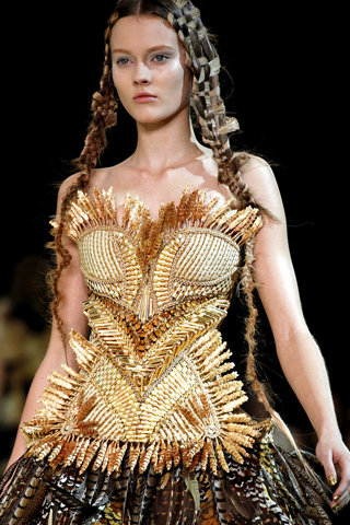
I know this isn't really a textile, but come on.  It's amazing.  Look at my first post, and you'l know why I love it.  But anyway, I posted this image from Alexander McQueen because I feel like it utilizes texture and materials to communicate the ideas behind the piece.  


What struck me about this image from an Oscar De La Renta show was the 3D pizzazz element!  I think some of the roses are 3D pizzazz.  I think the cleanness of the overall print and its classic subject matter allow for the success of the 3D pizzazz element.  

Sunday, October 23, 2011

Post Nine: Jackpot!

I went to a casino in Westchester this weekend.  I'm aware of how tacky that sounds, but it was pretty exciting.  The atmosphere was very...alive.  Though all aspects were completely overdone and contrived, the entire ambiance was visually and aurally intriguing.  When I got passed the oddly themed slot machines and their equally odd illustrations, I was able to see some interesting colors and textures that make me think of techniques I learned last year in 2D, and things I'm learning now in VC1.  After seeing some particulars that stood out to me, I decided to apply to them the things I've been learning.  


This is the tablecloth at the in-casino restaurant, Nonna's Trattoria.  The ambiance was very cheesy, hence the all-too-classic, red-and-off-white check/gingham thing they've got going on.  

I liked how the pattern looked because of the angle of the picture I took.  I did a little experimenting in Photoshop, playing with spacing and widths to try to get a similar effect.  


They had these strange, rainbowish panels on these pillars; depending on the angle from which you looked at them, they looked different colors.  I guess it was because of the flash of my camera, but all the pictures came out the same color.  I though that was pretty cool.  I also dug the panel's texture; it was a kind of foily something.  


I took this as kind of a joke because my friend was making fun of me for taking pictures of random inanimate objects.  But later, when I looked back at it, I really enjoyed the cork.  I never really looked at it so closely before this picture.  

The two preceding photos' textures both affected me; I wanted to see how they would look together. A classmate of mine did the last project out of cork, so for the past few weeks, the material has been in the back of my mind as an interesting textile.  The stripes really made me appreciate the value gradient in the foily panel.  

Sunday, October 16, 2011

Post Eight: Not A Hair Out Of Place

We Mazzolas are usually fashionably late; yes, even when it comes to spring cleaning.  This weekend was devoted to combing through our closets, and these photos are from my mom's.  She's had these two fur coats since before I was born, before my sister was born, and maybe even before she was married.  I've had to do my fair share of research on the fur industry for various class assignments, and I've come to the following conclusion: its methods and principles are absolutely horrific, but the product is phenomenal. Feeling the softness in your hands is like nothing else.  These two jackets in particular remind me of the glamour of old Hollywood; they just seem so lavish and elegant.  1930s Hollywood is a huge inspiration for me; I've always adored vintage-y things, but my appreciation for this particular decade was solidified a couple of months ago when I was working on the summer assignment.  What affects me most about the time is the attitude; there's a certain ownership of self that the women who wore those clothes possessed and exuded.  Looking at and feeling these coats was all I needed to whisk me away into that time.  Ahh.  


Drop dead gorgeous (too soon?) -- seriously.  I love how the horizontal lines are so prominent; it's like getting to peek into how the jacket was constructed.  


The softness and silkiness is almost unbearable.  In this rabbit jacket (obviously, I put it on), I can't handle how fabulous I feel.  Could you imagine making someone feel that amazing when he or she wears your clothes?  Ahh.  One day.  


This one's mink.  It isn't as soft as the rabbit, but, trust me, it's soft enough.  The thin vertical lines, for me, evoke a very specific image of the woman who wears it.  She's pretty fabulous, just so you know.  


Joan Crawford.  1932.  Letty Lynton.  Meow.  

Sunday, October 9, 2011

Post Seven: An Apple A Day

I'm not a huge Apple person; I use a Macbook Pro, but I'm a PC at heart.  In light of my personal OS preference, I do respect the company very much for both its devotion to design consistency and its revolutionary strides in product development.  The ever-evolving iPod line, the iPhone, and the iPad have engendered an entirely new market within the fashion world: accessories for these products range from the easily accessible mall kiosk covers to their higher-priced designer counterparts.  
A few days ago, my roommate showed me what looked like her watch; it turned out to be so much more!  I was floored!  I love that kind of innovation and function in design -- especially the wearable kind!  There was a time when I thought gadget accessories verged on tacky, but, after seeing this "watch" and coming across functional designer accessories, My mind was changed.  I think that's a wonderful avenue for a designer to explore -- accessories can help to define the aesthetic of a brand as well as keep it up-to-date with the latest habits of lifestyle.  Sidenote: I learned in my Accessory Industry class last week that the cell phone pocket found inside virtually all purses today is was initiated by the high-end market; they saw a need, so they made something to fill it -- with style.  


Here is what I first saw: an inconspicuous-enough watch.  I'm not one for that jelly-type stuff, but it's cute, what with its square face and bold color.  


My mind exploded when my roommate detached her iPod Nano from the wristband.  For the preceding few days, I had thought she was wearing a mildly edgy watch.  The Nano can be set to screensaver mode during which it displays a working clock face.  Ahhhhhhh!  

image.alt.H2876

$79.95 -- I went on Apple.com to see what other accessories would affect me.  I came across this unexpectedly cute clutch wallet [from Michael Kors] made just for the iPhone 4.  I assume the 4S will fit.....


$129.95 -- Michael Kors also sells this matching iPad case.  I'm not as moved by this one though; it only has one function: iPad case.  


Here's a glove from Karl Lagerfeld's fall 2009 collection.  It's a glove.  It's a phone holder.  It's everything you could ever need.  

Sunday, October 2, 2011

Post Six: Checking Out

I come from a suburb (Monroe!), and for as long as I can remember, my peers have complained of its underdevelopment; "There's nothing to do in this town," they would say.  I like to consider this attitude in conjunction with the 
When I was in third grade, they built us a Wal*Mart on a road that went through a wooded area.  As of this weekend, there is a multi-leveled shopping commons consisting of several strips, twenty-something stores (about nine box), seven restaurants, a bank, and a dentist's office.  I find it absolutely fascinating -- terrifying yet impressive -- how quickly the woods were "developed" into stores -- I used to have to travel at least a half-hour to go to these stores.  I know it sounds stupid, but it blows my mind.  I watched that entire area transform from what it was into what it is.  I still haven't decided if its good or bad, but it really made me think.  
The latest addition is an Old Navy, whose subtleties of branding I hadn't before fully appreciated.  


This is the sign that greets you.  One of the signs that greets you.  I had never been to a Target before this one opened.  There's another party store on the other side of the plaza.  I had to go in the Old Navy (what kind of Monroeian would I be if didn't visit?!).  


This was quite possibly my favorite thing about the new store; it's a very neat display, and it completely appeals.  I appreciated the chromatic ordering of the shirts.  I bet the numbers on the fake scoreboard mean something.  I'd like to look into that.  


Gah this is so attractive.  I love these block letters and how they interact with the clothes behind and below them.  


This is what you see when you first walk into the store.  They're creepy, I know, but I like them.  They remind me of the Old Navy commercials, and I really appreciate the store's branding.  I like observing the image a company puts forth with its advertising; I think these mannequins are a pretty accurate exemplification of Old Navy's.  


This is just fabulous: so many of my favorite things.  Clean block lettering, chromatic ordering, expressive t-shirts, and intent shoppers.  I love this display more than that basketball one.  The other was adorable, but this is much more elegant -- even so, it still maintains the casual, jovial attitude put forth by Old Navy.  The displays made me think a lot.  

Sunday, September 25, 2011

Post Five: Hitting the Road

As I have mentioned before, my relationship to New York is odd for a dorming New School student because I actually go home -- to my house, an hour upstate.  Naturally, the road I use to get to and from these two places is a bit of a routine, not to mention something I have come to trust as a part of my big, at-least-four-year city experience.  This week, I interrupted the drive to take photos of Orange Turnpike (the first/last major thoroughfare I see when traveling to/from the city) and, more specifically, what recent rains have done to it.

I found that there was something very dangerous about the whole experience -- pulling over, walking the shoulder, taking pictures of the hollowed pavement that looks like it might snap any second, etc.  While I'm normally a total wuss when it comes to being frightened, I was given quite the adrenaline rush.  I think  it was because I viewed the whole thing semi-artistically.  I let that sense of danger inspire rather than frighten me.  It was kind of like one of those beautiful natural disasters or something -- like a tornado; you know it's pretty dangerous, but when you see it, you stare because it's just that cool.  I understand that tornadoes do more damage than potholes, but you get the idea.  I was moved by how the broken road made me stop and think, and I want to design things that do the same.


This picture was so scary to take -- but at the same time, I wanted so badly to be on the other side, to see what the underside of the road looked like.   


This is the most treacherous-looking part of the road, and possibly the most awe-inspiring.  It looks like the wake of something; it makes me want to know exactly what happened.  


I love the way the Komatsu visually hugs the road.  Something about that relationship seems just twisted enough to fit perfectly within the photo-shoot.  It makes me want to walk through the yellow arm and look at the road.  I'd love to imbue that kind of desire.  


I'm obsessed with how chronological this scene is; I can tell how the road buckled before it caved -- like a fossil.  


While this close-up might not look too devastated, I think it speaks volumes.  The horizontal divide separates the two kinds of pavement" the dark, cracked original, and the cobbly, loose, newly fallen addition.  I just like the subtle and deep contrast.